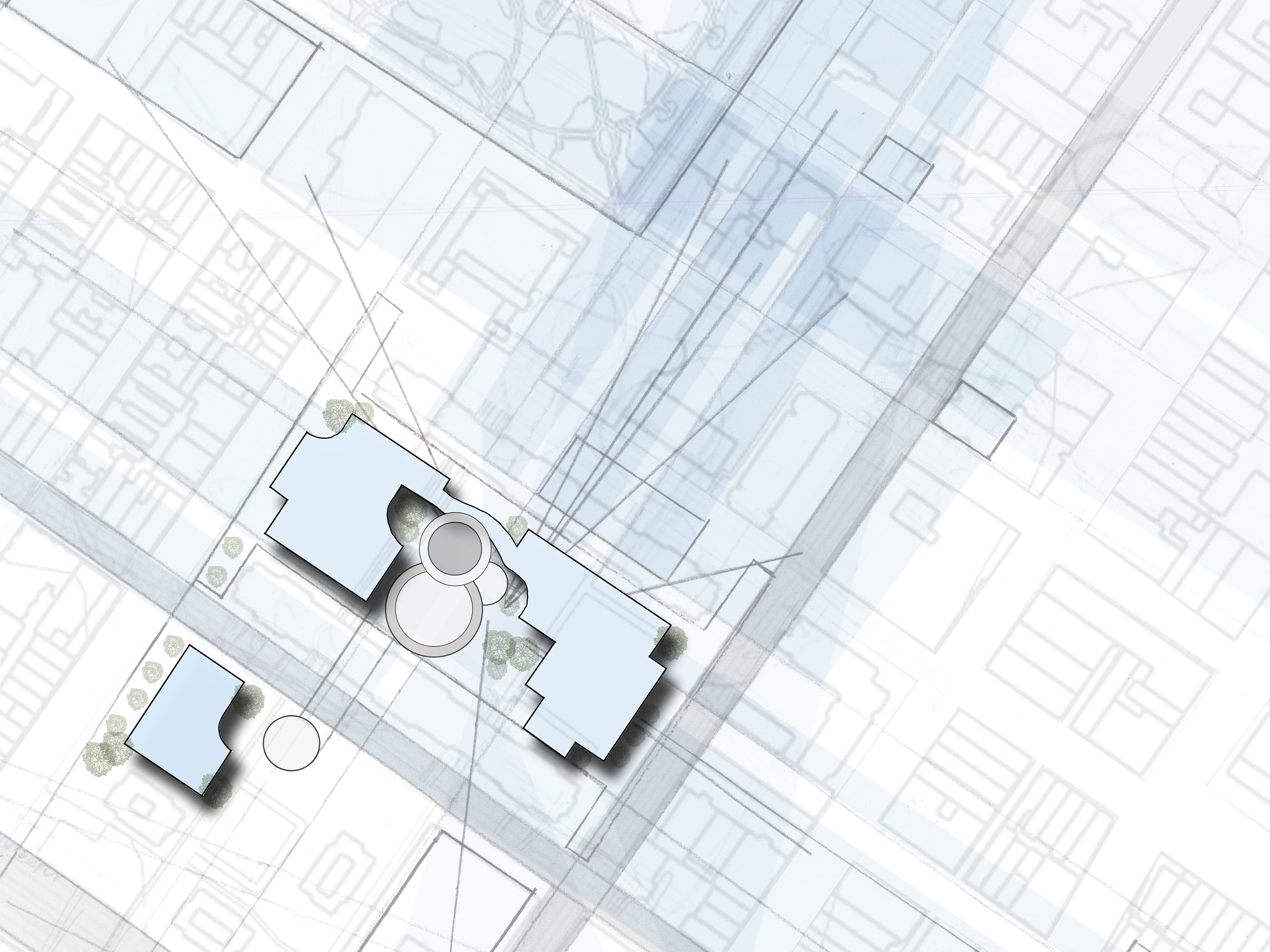
When given a prompt to think of four meaningful, connected places around campus, nothing jumped out at me at first. Over time I thought about places I enjoy going to on campus, which made me think of the architecture building atrium, Plaza of the Americas, Marston library, and Century Tower. These places are typically seen as points of gathering, but I also found a narrative of enjoying the places alone. My study is the multifaceted experience of these places with a focus on why I am drawn to these places.
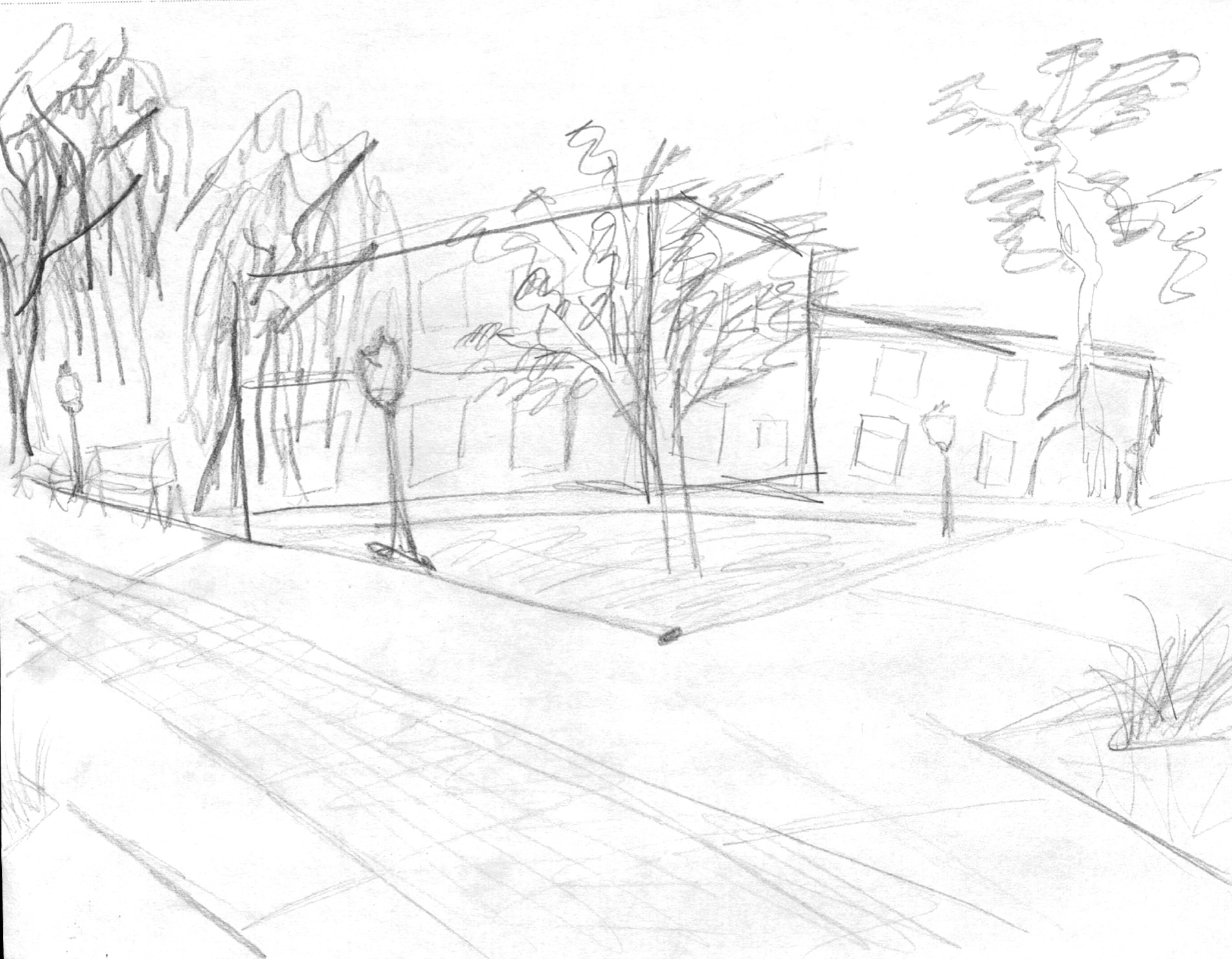
I began this thought process by thinking of a word associated with each place and deciding what about the place’s experience made me feel this word. Doing this exercise made me realize that I feel similarly when I experience these places alone vs. with a group. After thinking of the four spaces, the first step of the assignment was to draw a perspective drawing.
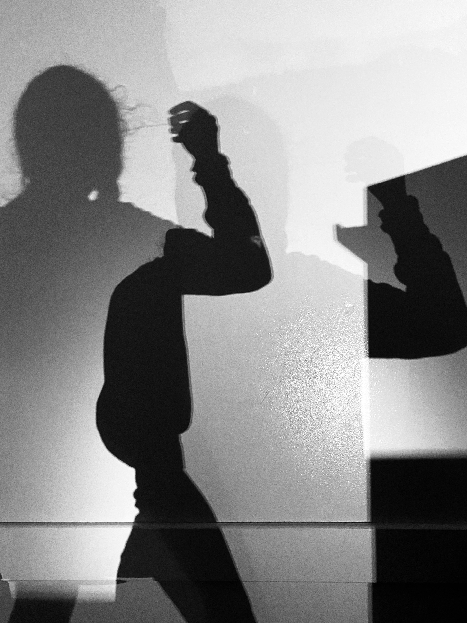
This drawing is based off of the double shadows casted from two light sources. I was very interested in how the shadows break and overlap. With these qualities, the variation in tone is also something to appreciate because the shadows are casted on a 2D wall surface. There is a range of values from dark black, dark gray, lighter gray, and white gleams. This creates a sense of light layering. The shadow appears to be duplicated, but there is a variety in value and contrast from the umbra and the penumbra. Umbra is the fully shaded shadow created from an opaque object, which would be my arm. The penumbra is the partially shaded outer region of the opaque object’s shadow, which results from the additional light source. I also wanted to depict the glowing light in the bottom right of my drawing, which is the light coming straight from the flashlight, uninterrupted.
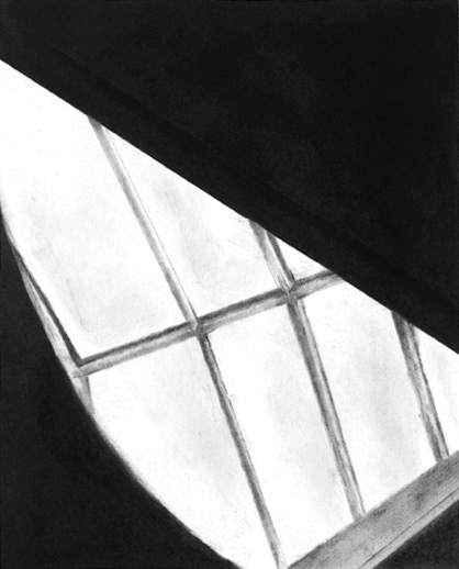
This drawing primarily focused on high contrast and layering of spaces created from natural light contrasting dark objects. Highlighting the stark contrast of light is what conveyed the layering of spaces and 3D qualities of the image while also serving as a frame.
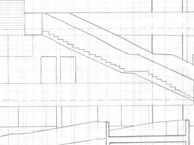
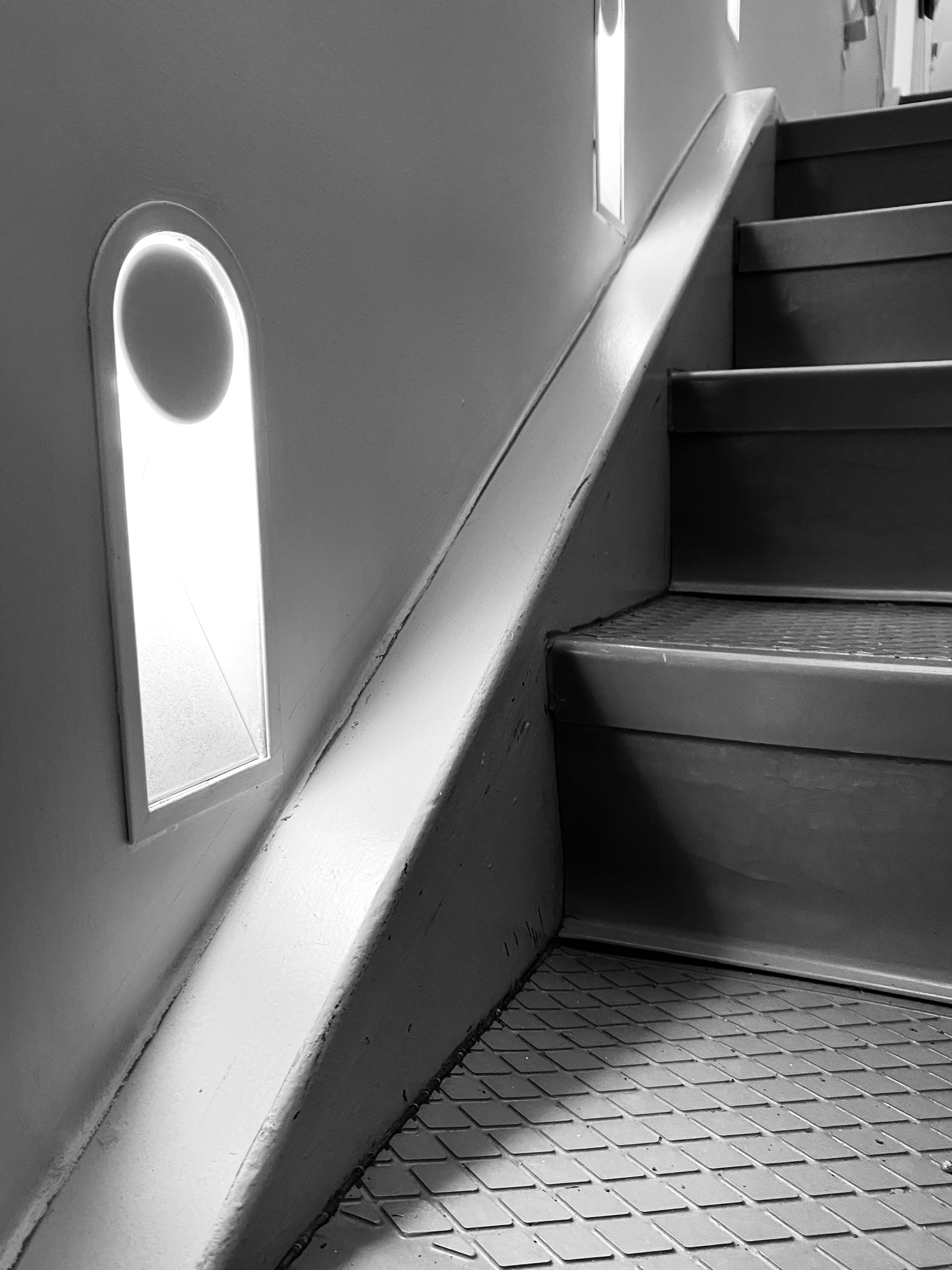
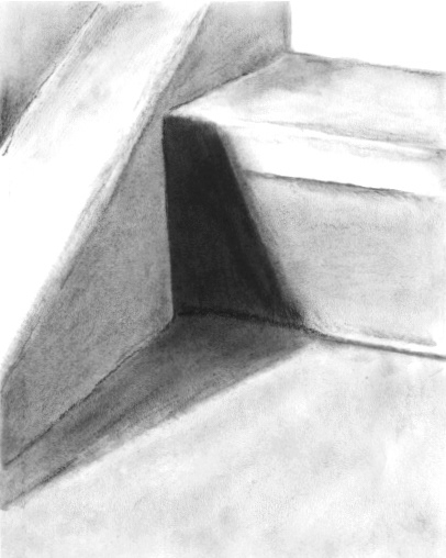
was based on an image of a shadow being casted onto the stair from a small light on the stairway wall. The bending of light into a folding motion as it hits both the tread and rise of the stairs in different tones. One difficulty I experienced in this drawing was how many surfaces were in the image. Choosing lighting on a staircase emphasized the rhythm and repetition of the shadows, as they were periodically placed on every step. Another thing I discovered about this drawing was the softness of the shadow. Though the shadow has a much darker value/higher contrast than its surrounding, it still maintains a quality of diffusion as it hits the stairs. Acknowledging the gradient and variety of tones as edges meet and how light moves across a surface is important in building the drawing to appear three-dimensional. It is important to understand how light moves across and interacts with different surfaces.


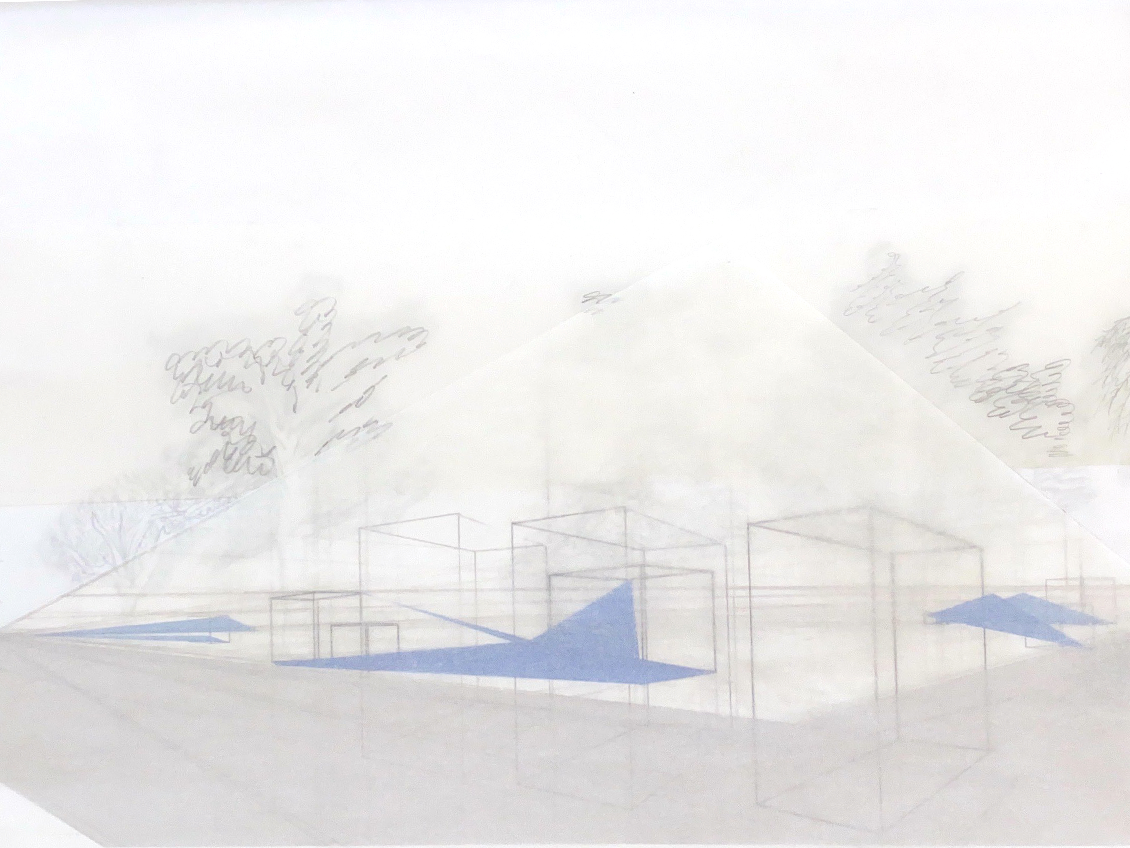
The word I chose for Century Tower was grounded because looking at it reminds me of how grateful I am to be at the University of Florida and how many opportunities I have available to me socially and academically. I focused on the idea of sound produced by the carillon inside the tower. When I cannot see the tower, the bells remind me that I am here and validates all the hard work it took to get here.
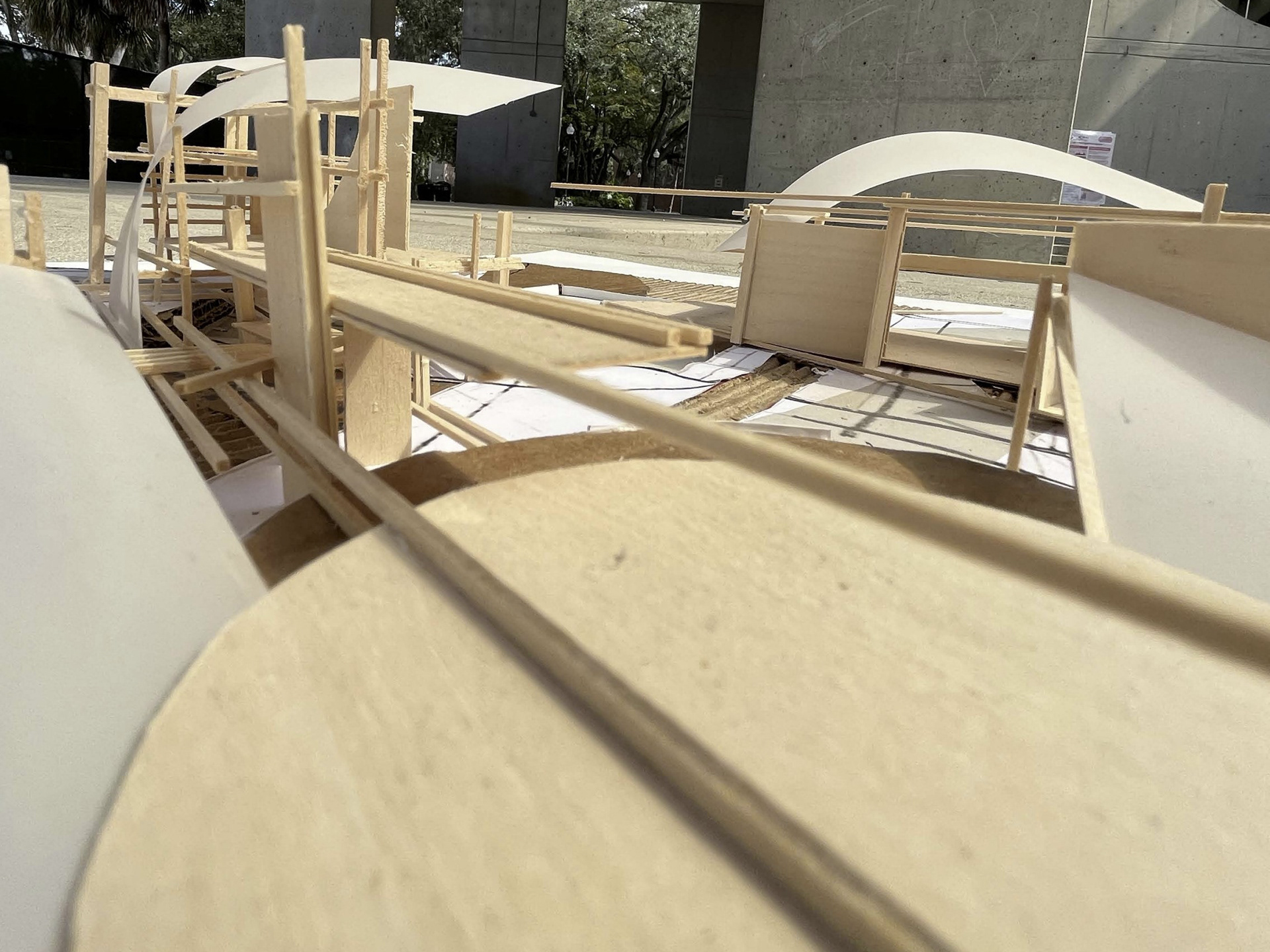
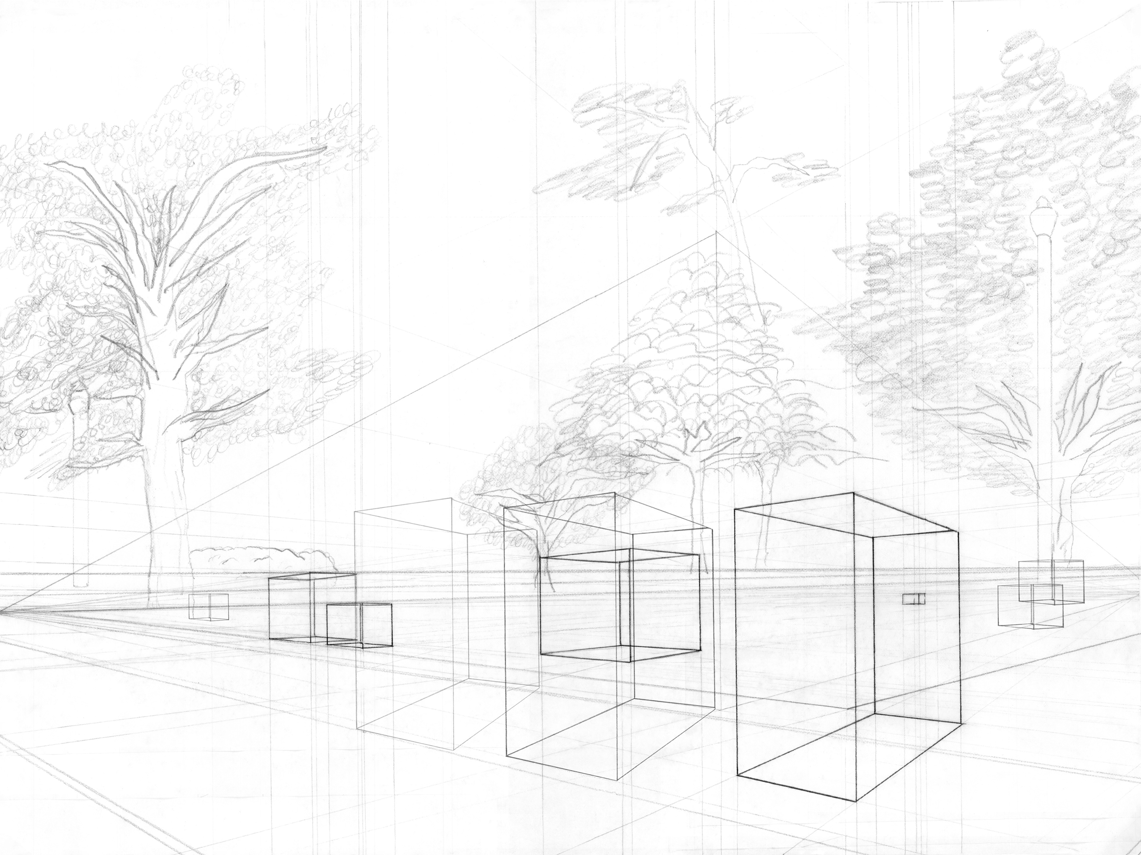
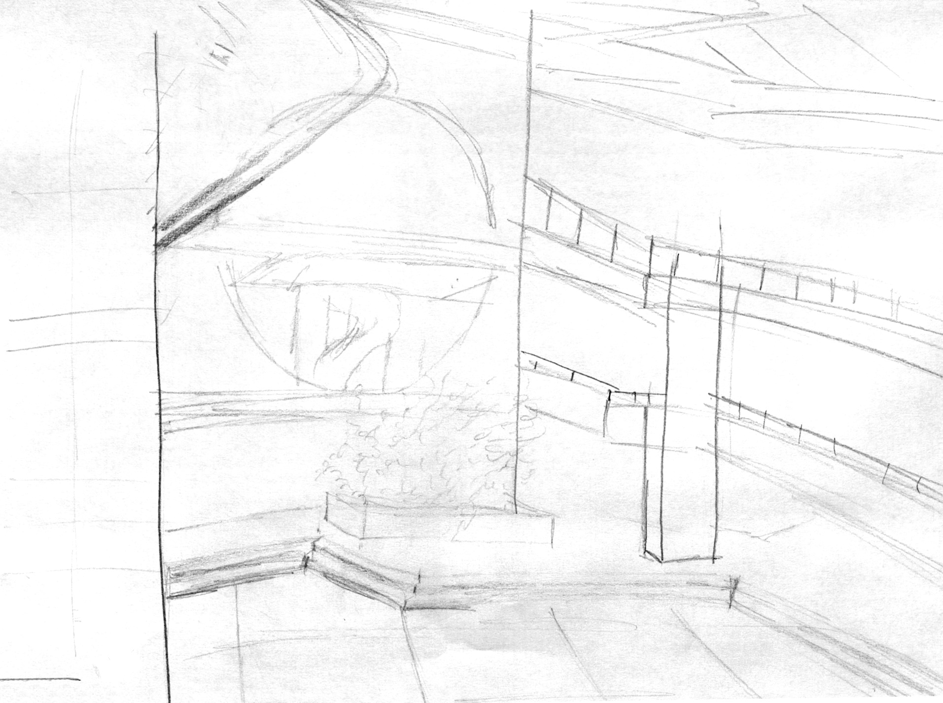
The next part of the project consisted of adding additional information on new layers. I drew an additional perspective drawing layer for each place that adds another level of detail and information.
The focus of Century Tower is the movement of the sound radiating out from the carillon, which is represented by the gray and blue tone. The blue moves downward, unlike the gray, to emphasize how it directly impacts me while visually expressing the idea of feeling grounded. There is a greater degree of the grounded feeling the closer the sound is to me, which is why the blue tone gets darker as it gets closer to me. This provides a contrast from the general experience, which is why the gray is darkest closest to the carillon, the source, and dissipates the further away it gets.
The final component of my focus was adding some visual depth with mixed media sources. I noticed how the itinerary of these places contributed to my overall experience, which is why I used trace paper to frame and highlight it. The verticality of Century Tower is emphasized by being uncovered. A strip of mylar with two lines emphasizing the detailed area above the doorway where tours are held remind me of where I once was and how grateful I am to be where I am now.
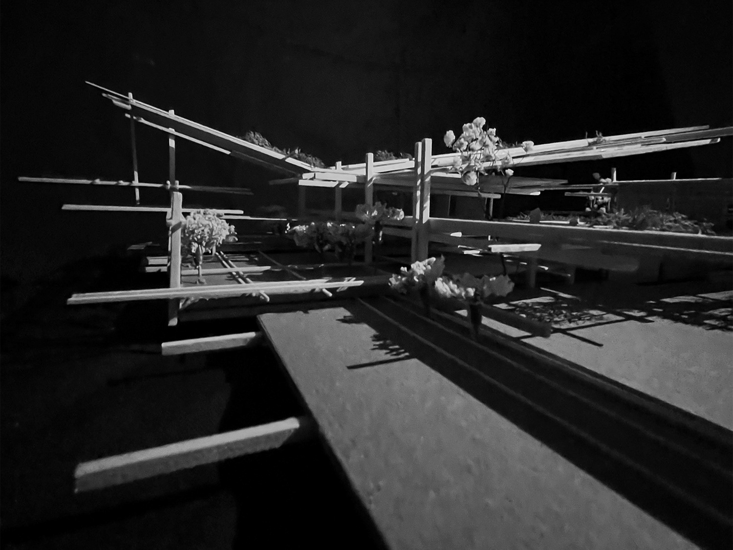
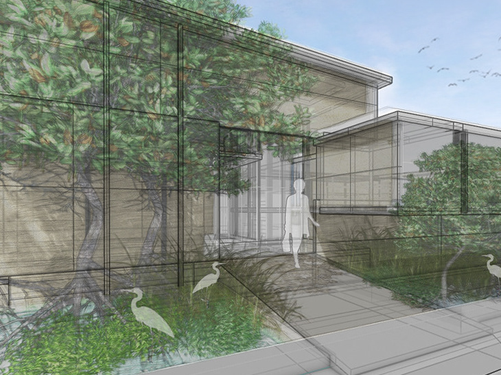
My idea for Plaza of the Americas represents the feeling of peace with a focus on the people and greenery. These components contribute to the idea of relaxing and taking time for myself away from work.
Volumes representative of groups of people were added on the additional layer.
The focus on the movement and clusters of people in Plaza is also seen in the tone. Gray tone highlights the main walkways cutting across the plaza where people come and go for classes, the nearby library, or to stop and relax. The blue tone connects the clusters of people that do choose to stay. I decided to make this a part of my personal experience because that is how I best enjoy the plaza myself, sitting and relaxing on the greenery.
The open tree canopies and sky is left uncovered in the plaza set Some of the leaves on the trees not covered by the trace are re-scribbled in to express how the greenery provides me peace.

Marston library gives me the feeling of productivity, which was enhanced by the availability of desk space and lighting. The point of view I chose to draw was from a private desk space along the wall of windows where I often sit to do work in between classes. The perspective only allows viewers to see the desk I am occupying, the wall of windows, and the ceiling. Additional desks and bookshelves were added for more information and detail.
This set of drawings focuses on the change in the lighting across the desk, which contributes to my individual experience while working. The gray is the general shadow created through the windows at the typical afternoon hours I am at the library. The blue tone is representative of how I like the sunlight hitting the desk, present but not in the middle to produce a glare on my laptop. The rows of desks following my horizon are framed by the trace paper. Scribbles on the mylar woven through the trace express the feeling of productivity.
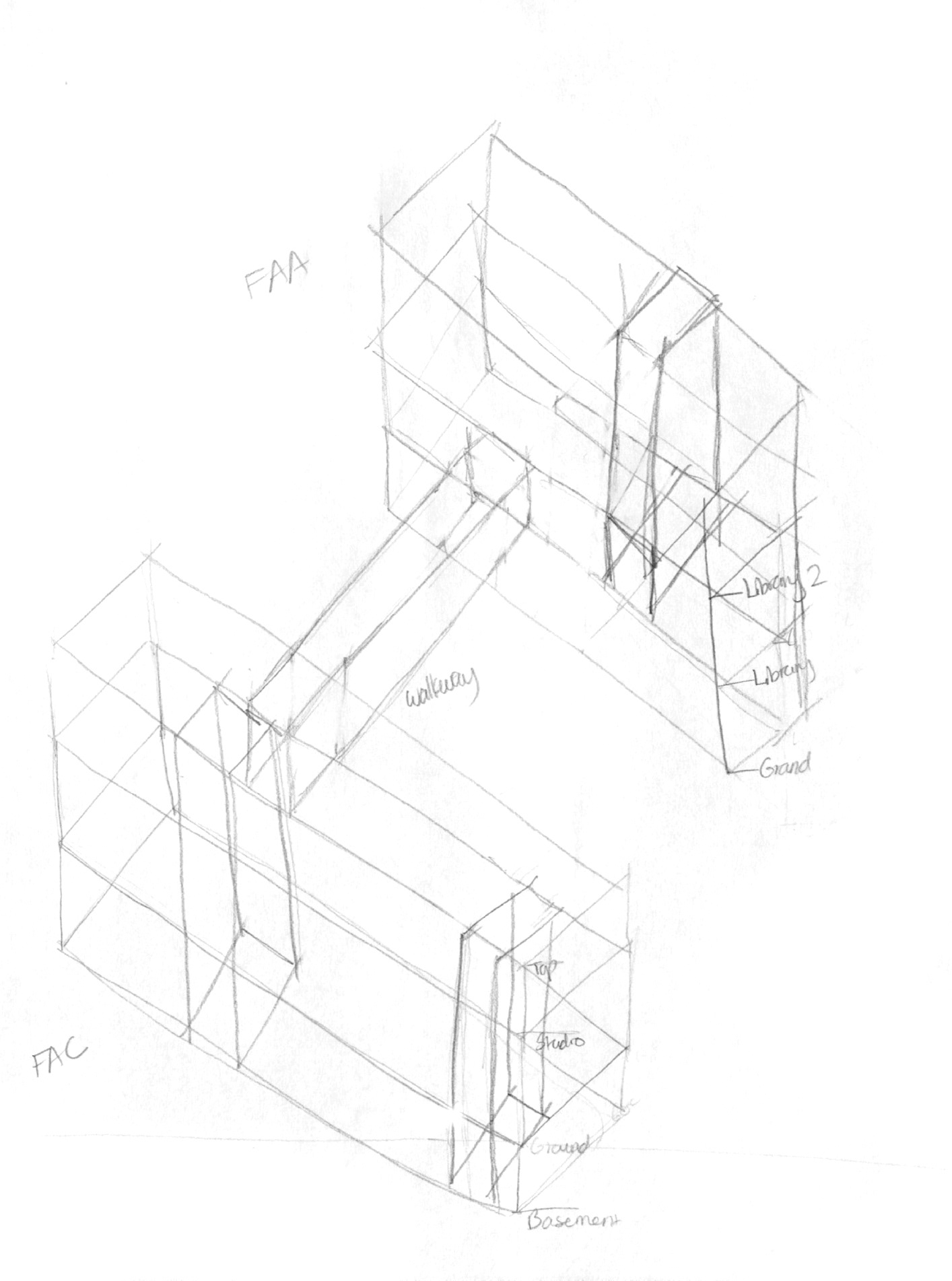
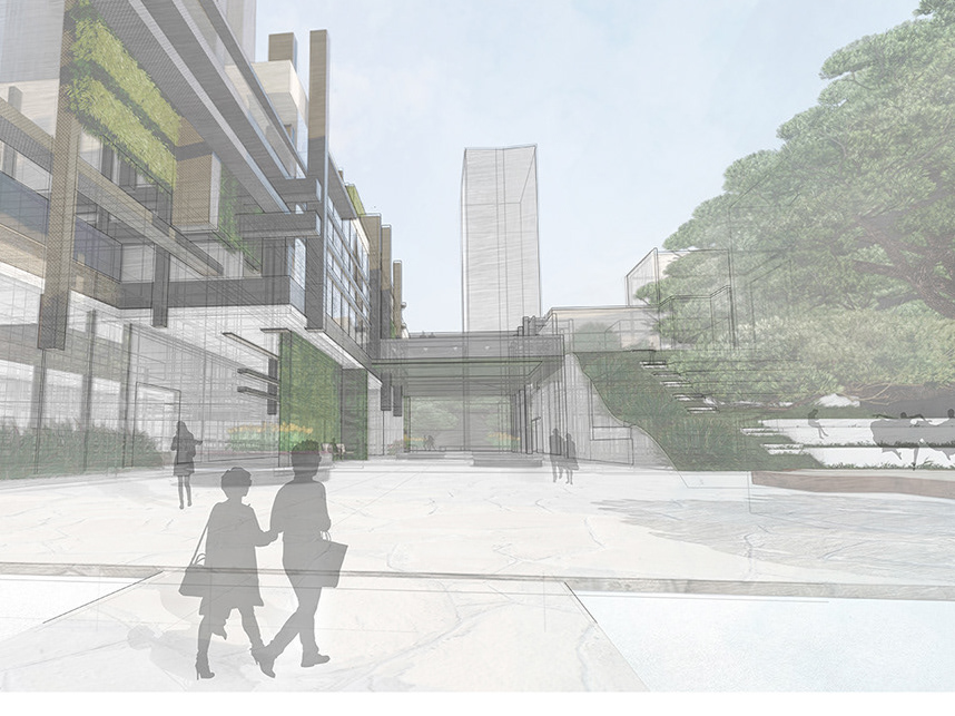
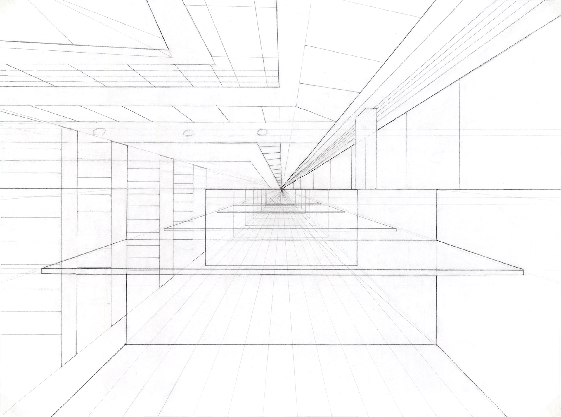
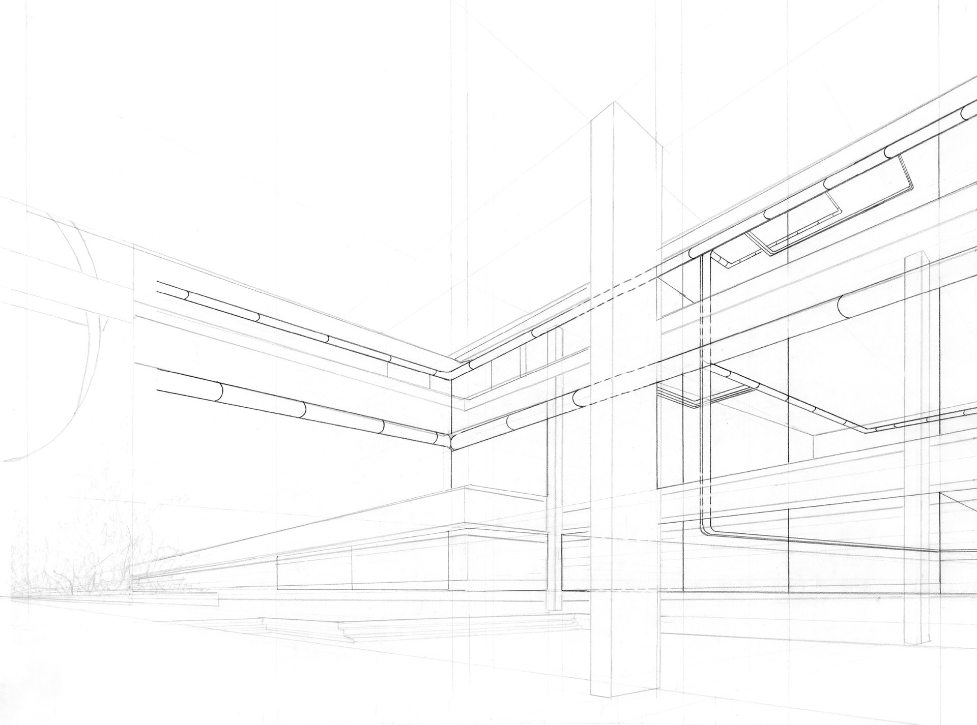
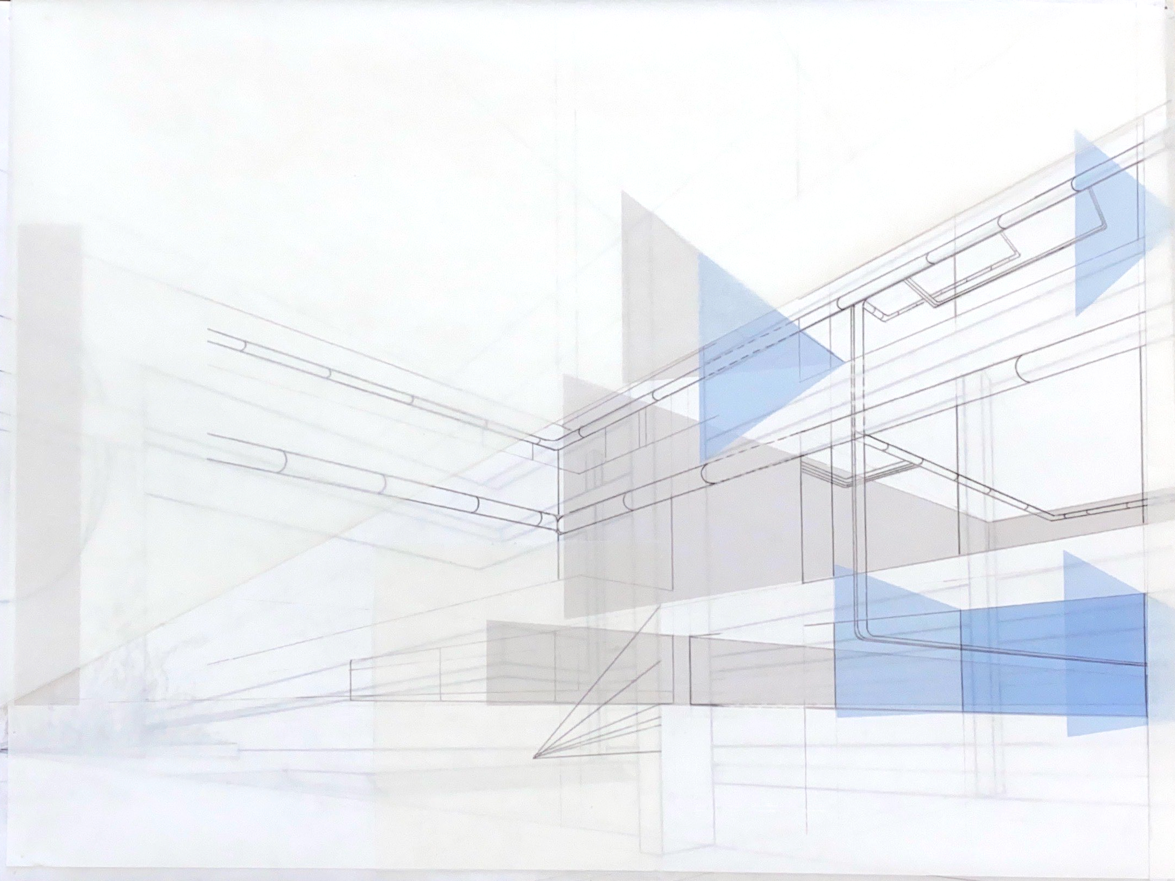
The word I chose for the architecture atrium was connectivity in terms of people and ideas. The perspective I drew showcases the various studios, open atrium space, and the gallery to express how students and faculty of different levels of education are able to connect and share advice, experience, and ideas. Depth of each studio room as well as piping connecting them all was also added. This information helps convey the translation of ideas and mentor-ship between students and faculty.
I pulled from the interior studio walls through the large windows facing the atrium to add to the movement and flow of ideas from different disciplines and education levels. I chose the blue from the first floor studio because I look there for what I will be doing in the near future as well as the top floor studios. The top floor studios are home to the junior studios, whom I seek advice from friends that are current and past teacher assistants along with peers in other clubs about schooling post-pin up.
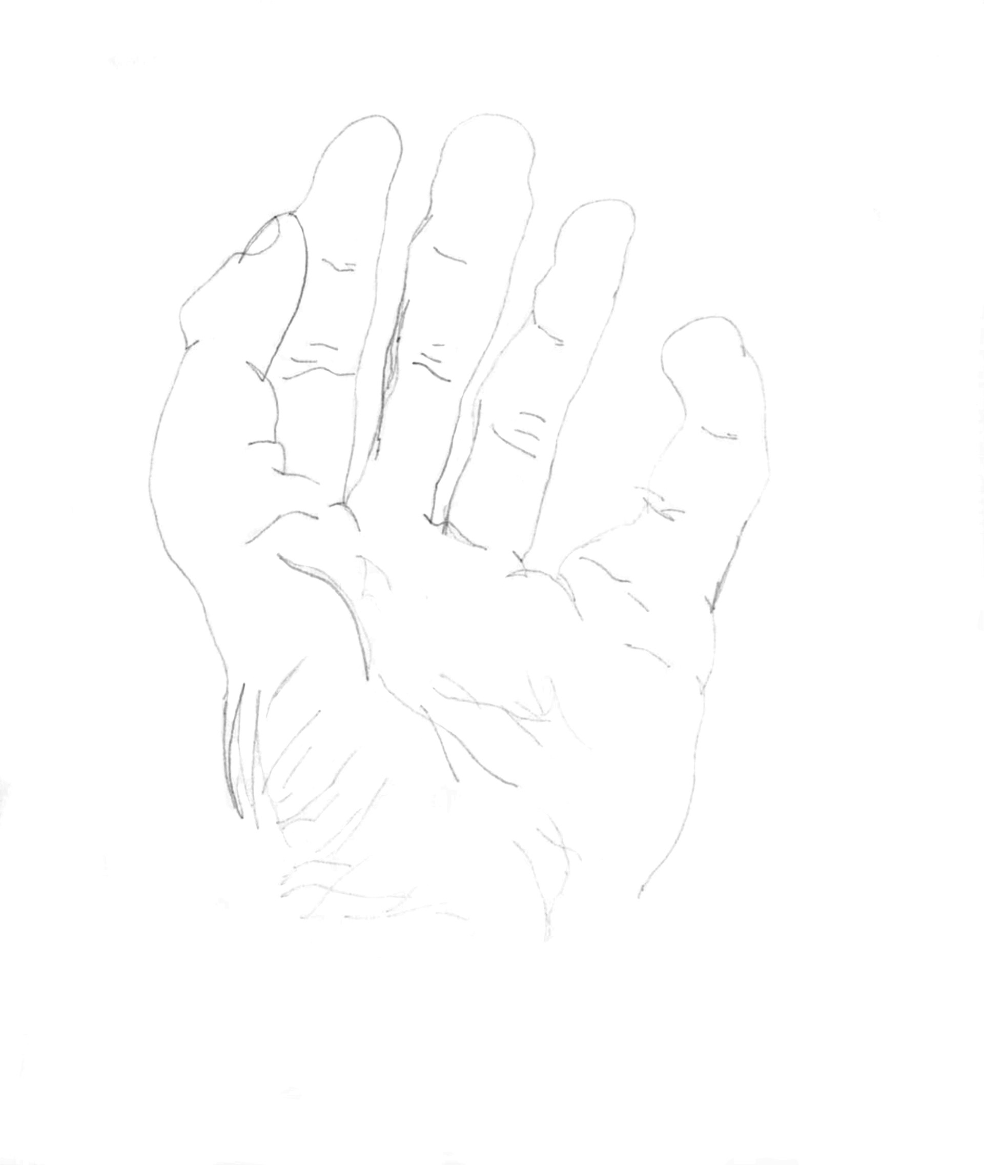
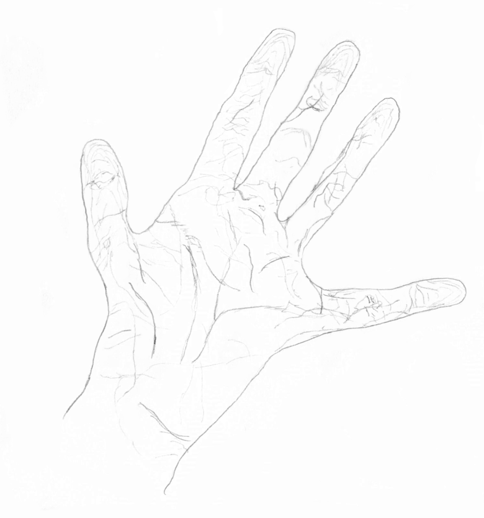
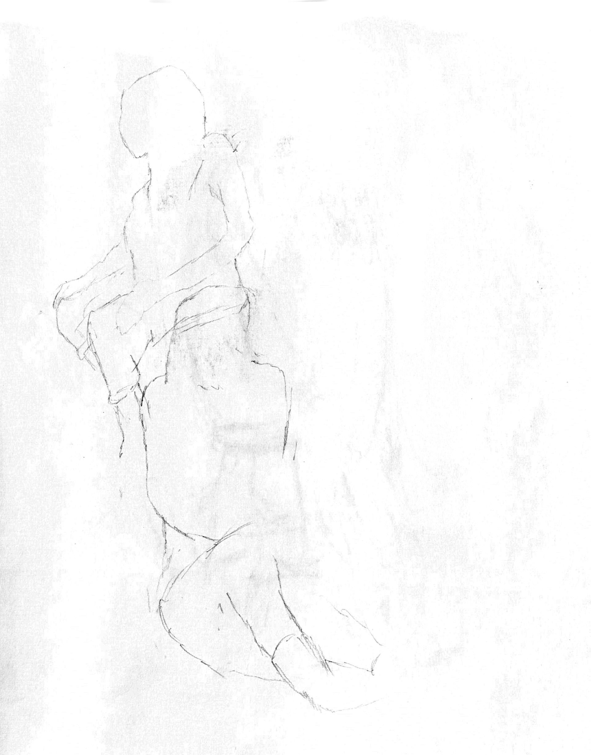
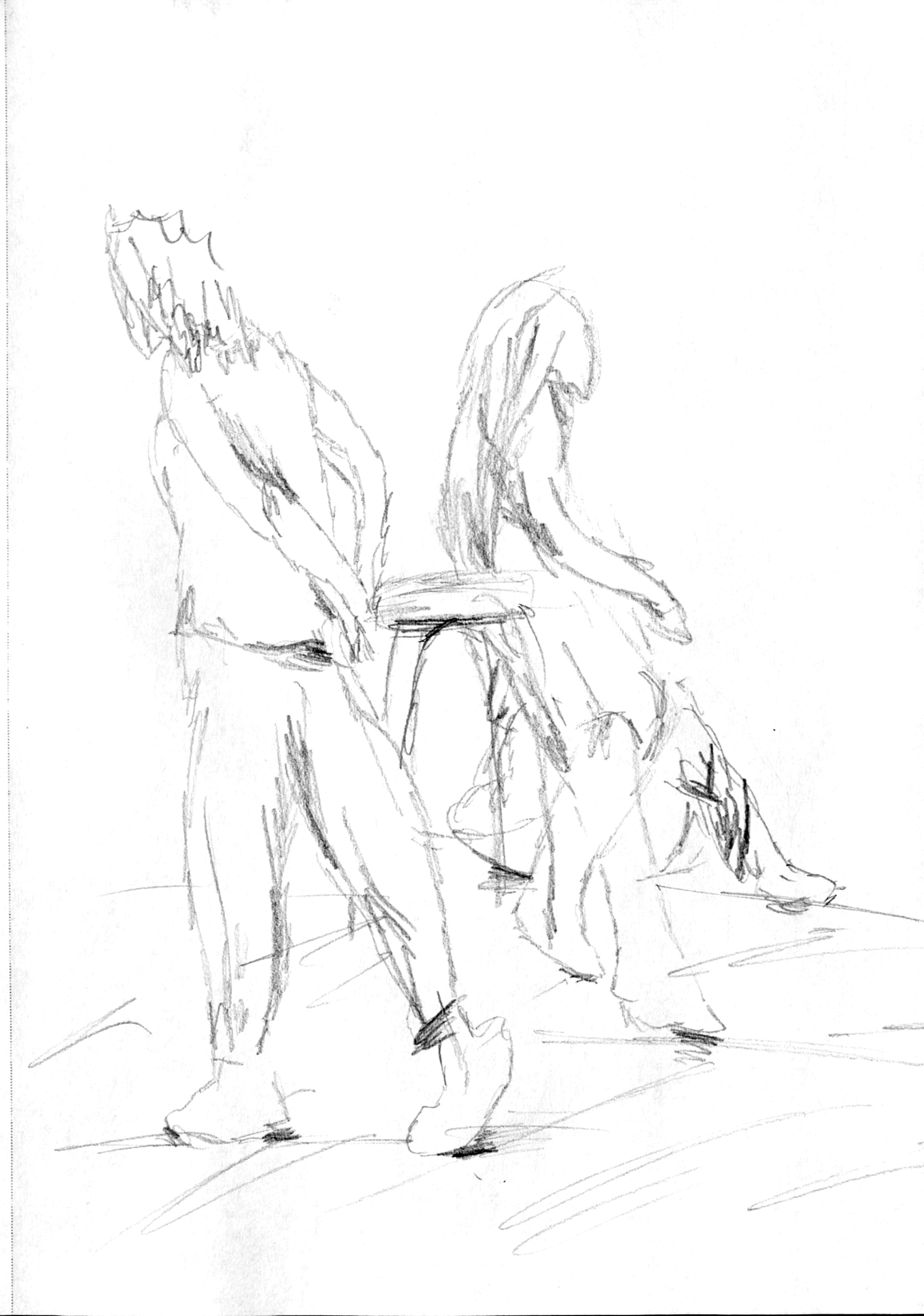
Sketches